Sunday, April 5, 2015

Aesthetic Redesign

To make the functional redesign pleasing to the eye, a adaptation was made, namely the aesthetic redesign. Again, fist we present the old version then then new version:
[home page & redesign]

[product page & redesign]

Logo
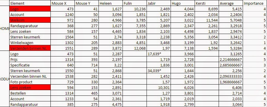
Based on the eye track results less than half of the respondents have looked intensely at the logo. As brand identity is important for a company to strive in a competitive industry, it’s crucial to get your name out there. The logo has therefore been enlarged in the functional redesign, to be more noticeable.
Based on the current logo design a new one has been developed, in which the orange pattern at the end of the brand has been brought to the beginning of the brand.
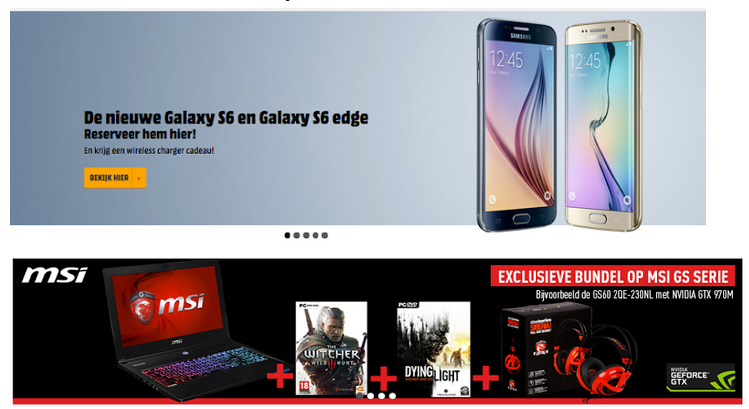
This would call for more attention on the orange pattern that is used, because western people go through a website from left to right. This attentional guidance would mean that the orange icon in the logo will be perceived and noticed first, which is important because the icons will be used throughout the design of the website.


Template

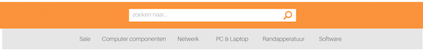
As Afuture works in the IT / multimedia industry, a look has been given at templates of well known companies that work in the same branch. During this research, it became clear that these company’s contain the same template elements. Most of the important elements have therefore been incorporated, because it already has proved that it works, this integration will make user recognise the industry and the interaction on that the website has.


Branding
The website makes use of four main color codes: Orange, Gray, White and Black. As these colors define the house style of the website, a better look has been given at the colour palette. To enhance the visual pathway, the colour codes have been slightly adjusted to enhance the contrast of elements, which make the stand out. At the same time the colors create unity, because the continuously come back in different pages.

Buttons
The buttons used on the website have derived from the icon on the logo that has been described earlier. To create harmony and unity, the colours and shape of the icon are being reused as buttons.
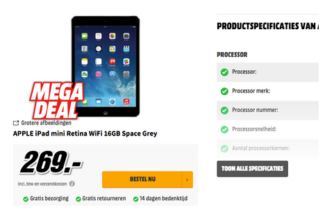
Product page
The product page of Afuture contained very little visual feedback of the product. This option has been worked out in the redesign, making it possible to view more angles and picture of the product chosen.

User interaction (Product page)
To stand out in a competitive industry a new option has been given on product specification. People can now hover over a certain element of the product and will perceive a zoomed in product description on the specific element that has been hovered above. This new option, gives an new user experience and makes way for a new viewpoint on understanding products.

Functional Redesign

Considering what came out of the tests [eye tracker, visual search and change blindness], a functional redesign was made. First we show the old version, followed by the redesign:


[home screen & version 2.0]


[product page & version 2.0]
This redesign was based on our previously done analyses:

As we find the search lens important, there should be improvement to make the lens more apparent to the visitors.
With the visual search the elements that took longest were ones that are important to us. It was quite surprising that the logo took relatively long in the visual search while taking least time with the change blindness. Some redesign of the logo should be in order as it is an important element of a website.

Thursday, April 2, 2015

Analysis of similar webshops

Home Page

Header
The webshop's header always consists of the following:
  • Logo of the website/company  [left]
  • A search bar [middle]
  • A sign in element [right]
Sub header - menu bar
Underneath the header, most websites have a bar containing all different categories of which the webshop supplies goods.
Banner
Subsequently underneath the menu bar online shoppers always find a banner displaying new or sale products.

Promotions - suggestions
The lions' part of the home screen contains products with short to no descriptions. These serve to entice visitors with for instance special deals or suggestions based on their online behavior.


Product Page

Displaying the product
With many pictures of multiple angles the product is presented to the viewers.
Product description
On the right side of the product a short summation of the most important specifications is placed. Underneath this information the price is placed showing the price it "used to be", e.g. "from 1.589,- for only 999,-". The 'order now' button is placed right under the price.
Detailed descriptionIf the visitor require more information about the product, on the lower part of the page the full description is placed. The Mediamarkt has a slightly different approach by making the specifications responsive.


Monday, March 30, 2015

Change Blindness and Visual Search Results

Test 1: Change Blindness

Test description
A pre-written program was delivered to us in order to conduct the change blindness test. The goal of this test is to test how people can see the difference between two identical pictures with a small element missing. The program shows first the complete picture then a grey screen then the second picture with one missing element, all within an interval of seconds. For this test we asked some fellow students who also follow the same course (VCD), but in order to avoid some biased results, we also asked other students from other faculties.

Preparing
The element selected to be tested during this test are a mix between elements discussed in the list before (previous post) and elements that aren’t. We think that by selecting the elements this way we will get an idea if the viewers can easily find the elements we think that are important easily, and if they think that other elements are important and we missed that.


Home

Participant’s results varied greatly.

The logo was fastest to be found.

The star rating and the search lens were hard to find.
Considering the importance we attribute to it, the account button takes relatively long to be noticed.

Product
The picture of the product was by far found quickest.
Again the star rating and the search lens proved to be hard to find.
Other elements took similar time to be found.

Visual search

Home
Taking relatively long were the logo, the ‘welcome’ text and the banner. These three are regarded as being important to us.
The product tab and the search lens were relatively timely noticed while also having priority.

Product
The price and the picture of the product were no trouble for the participants to find.
The search lens on the other hand stood out by being by far hardest to notice.  

Overall Conclusions
As we find the search lens important, there should be improvement to make the lens more apparent to the visitors.
With the visual search the elements that took longest were ones that are important to us. It was quite surprising that the logo took relatively long in the visual search while taking least time with the change blindness. Some redesign of the logo should be in order as it is an important  element of a website.


Eye tracker results

Results


Home

Less than half of the participants have intensely looked at the logo.
The account button was only noticed by half off the participants.
Seven of the participants have intensely looked at the banners at the right.
The “welkom” message was perceived by everyone.
The footer was rarely looked at.
Search bar was perceived by everyone.

Product
Product picture was everyone’s first target.
Price was intensely looked at by everyone.
Half of the participants looked at the specifications
Half of the participants looked at the product information
Category list was perceived by everyone.

Conclusion
Account button had a high importance rate. Only half noticed this button. This element should draw the attention from the viewer. Important elements such as the job offer and the certification mark were perceived by seven of the participants. This could be an opportunity for making the account button more noticeable. All other elements rated as important were perceived by everyone. For the home page, the order in which the participants looked at the elements seems to be completely random. There seems to be no fixed pattern in which the eyes flow. The product page does seem to have an element which draws the eyes’ attention. In all cases the eyes seem to go near the product image first.


Tuesday, March 3, 2015

What!? What is it you guys want to show?


Page 1 - Home Page

Number
 Product of Elements
Importance
Why?
1
 Logo (home button)
4
The logo is the image of the company
2
Search balk
5
The visitors should be able to search easily and quickly for a specific product.
3
Information button
1

4
Contact Button
2

5
Account button
4
Loyal visitors should access their accounts easily, and also by emphasizing it, new “loyal” visitors may be attracted.
6
Category list
5
The division of the different categories make it easier for the visitor to find the needed object.
7
Shopping chart
1

8
Welcome text
5
This text is the introducing message and should communicate more about the site.
9
Certification mark  
2

10
Advertisement
4
Advertisement for several products is important in order to reach more audience.
11
Job offer
1

12
Footer
1

13
Background
4
The background influences the perception and the experience of the visitor.

Page 2 - Product Page

Number
      Product of Elements
Importance
Why?
14
Product title
5
The title is the given name and by which potential buyers and users define it.
15
Product picture
5
The overall preview of the object plays a big role in making a decision (either to buy it or not)
16
Price
5
The price is one of the important elements consumers looks for before buying.
17
Order
4
Once the decision is made, the visitor should be in state to order it directly.
18
Product Information
3
More informations about the product can help the visitors make decisions, but sometime they already have an idea about it. So it should be made available.
19
Product Specification
3
Extra specification is always handy for a well-knowledgeable visitor, but it shouldn’t be the most important thing as some visitors come already knowing the product they want.
20
Logistic Information
3