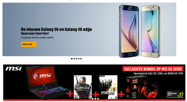
[home page & redesign]
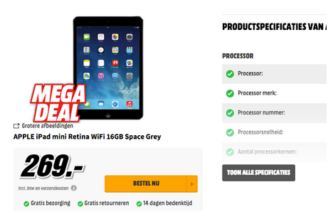
[product page & redesign]
Logo
Based on the eye track results less than half of the respondents have looked intensely at the logo. As brand identity is important for a company to strive in a competitive industry, it’s crucial to get your name out there. The logo has therefore been enlarged in the functional redesign, to be more noticeable.
Based on the current logo design a new one has been developed, in which the orange pattern at the end of the brand has been brought to the beginning of the brand.
Based on the current logo design a new one has been developed, in which the orange pattern at the end of the brand has been brought to the beginning of the brand.
This would call for more attention on the orange pattern that is used, because western people go through a website from left to right. This attentional guidance would mean that the orange icon in the logo will be perceived and noticed first, which is important because the icons will be used throughout the design of the website.
Template
As Afuture works in the IT / multimedia industry, a look has been given at templates of well known companies that work in the same branch. During this research, it became clear that these company’s contain the same template elements. Most of the important elements have therefore been incorporated, because it already has proved that it works, this integration will make user recognise the industry and the interaction on that the website has.
Branding
The website makes use of four main color codes: Orange, Gray, White and Black. As these colors define the house style of the website, a better look has been given at the colour palette. To enhance the visual pathway, the colour codes have been slightly adjusted to enhance the contrast of elements, which make the stand out. At the same time the colors create unity, because the continuously come back in different pages.
Buttons
The buttons used on the website have derived from the icon on the logo that has been described earlier. To create harmony and unity, the colours and shape of the icon are being reused as buttons.
Product page
The product page of Afuture contained very little visual feedback of the product. This option has been worked out in the redesign, making it possible to view more angles and picture of the product chosen.
User interaction (Product page)
To stand out in a competitive industry a new option has been given on product specification. People can now hover over a certain element of the product and will perceive a zoomed in product description on the specific element that has been hovered above. This new option, gives an new user experience and makes way for a new viewpoint on understanding products.


